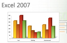
Charts are a great way to visually represent and compare data. In
Excel, the key ingredients for a meaningful chart are:
1. Accurate data selected correctly for preparing the chart.
2. The right type of chart for the type of data to be displayed.
QuickTip for an instant column chart
1. Select the comparison data (and labels for the data) to be
charted. Example: Sales figures for Jan through June
2. Press [F11] at the top of your keyboard.
If you selected the correct data, you should now have a column chart!

The number one thing you can do to increase your personal
productivity is to get training – and then practice what you learn!

1 Comment to 'Create an Instant Chart in Excel'
July 6, 2009
Wow – who knew it was that easy!
Leave a comment
Can You Have More Sales, Too?
Helping over 61,000 businesses like yours raise profits and build customer relationships using AWeber's opt-in email marketing software for over 10 years.